The Solidgate Payment Form offers exceptional adaptability and comprehensive customization options to meet diverse payment processing needs across regions. With its capability to integrate additional transaction-specific fields and control field visibility, it ensures a personalized customer experience.
Apply these options after you initialize the form. To change transaction parameters such as amount or product on an initialized form, use update payment form.
Through the form, take the opportunity to:
- choose one of the four ready-made templates default, flat, card or inline
- fine-tune every element via the
stylesobject to match your brand - hide or show any optional field to streamline the checkout flow
- rename field labels and placeholders in a single place with
formParams - replace the built-in submit button and trigger payments programmatically with
form.submit()
Template
Solidgate offers several default form templates with pre-configured styles. Using a template for a payment form from Solidgate simplifies the payment acceptance process on your website.
Templates offer a pre-designed and functional form, eliminating the need for customization. This ensures compliance with industry standards for both security and customer experience.
default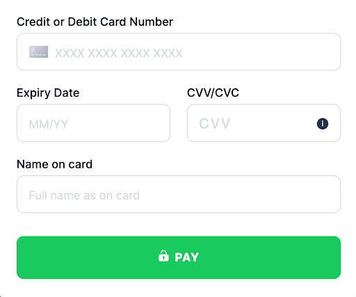
This traditional design with clearly defined input fields provides a simple, straightforward customer experience. It is ideal for businesses seeking a familiar, accessible interface without unnecessary features.
This template can easily adjust to different screen sizes, making it suitable for various devices.
flat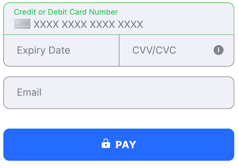
With a clean, modern aesthetic, the flat template removes shadows and textures to emphasize simplicity and minimalism.
It is ideal for businesses looking for a contemporary look that aligns with a flat design digital branding strategy.
card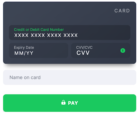
This template offers a bold, eye-catching design with depth and contrast, using shadows and highlights to create a sense of layering.
It is perfect for businesses that want to provide a dynamic and immersive customer experience, possibly for younger or tech-savvy demographics.
inline
The inline template provides a condensed, efficient layout, ideal for quick interactions and minimal scrolling.
This is ideal for businesses wanting to simplify payment processing or embed a compact payment form within a webpage section.
Styles
Payment Form offers a styles object with nested CSS properties. This approach allows flexible styling of your website without changing HTML or JavaScript.
This class targets all input fields within the form, enabling you to apply consistent styling.
To view changes, directly modify the input_group class in your CSS. Activation occurs automatically as the form renders.
Defines the style for the payment form’s header.
Adjustments to the header class become visible upon form load and are particularly useful for aligning with your brand identity.
Responsible for the overall container of the form, allowing for adjustments in font, color, or spacing.
The form_body becomes visible when the form is initialized and can be tailored to fit seamlessly within your site’s design.
Customize the subtitle of your payment form, enhancing readability and focus.
Changes are immediately visible, providing a quick way to align form instructions with customer expectations.
submit_buttonControls the styling of the form submit button.
To hide the button, set the display property to none in your styles. This class becomes crucial when you prefer a custom button or need to follow the specific design systems.
Wraps fields like CVV and Expiry Date in the default form template, enabling a two-column layout for a compact and organized look.
Alterations to this class are seen as soon as the form is rendered.
card_viewEdit the card template, such as changing the background color with a property like card_view: { 'background': '#3D4251'}.
This class is particularly impactful for branding purposes and customer engagement.
card_brandsControls the display of card brand logos, ensuring they fit well within the design of your form.
You can display card brands above the form using the {{cardBrands}} parameter in the {{formParams}} object.
Specific to the card number input field, this class can be styled to indicate valid input or errors, with immediate feedback enhancing the customer’s experience. card_cvv
Targets the CVV field, allowing for distinct styles during error states or focus, providing immediate visual cues to the customer. expiry_date
Controls the appearance of the expiry date field.
Customizing this field can ensure consistency with other form elements and can trigger when the field is in focus or an error state.
card_holderDescription
Defines the style for the cardholder’s name field, which is a crucial element for transactions.
A string parameter ranging from 2 to 50 characters. The pattern ^\w.{0,48}\w$ is used to validate the format.
The field specifies the name as it appears on the card, essential for transaction processing. It requires at least one space between the first and last names to ensure accuracy and enhance transaction conversions. For some PSPs, if the merchant does not provide this value, it is filled with the default John Snow. additional_fieldManages the styling of any additional fields that may be required for specific transactions. It ensures these fields are visible and styled according to the form’s design when they become relevant. zip_code
Styling the ZIP code field is important for address forms, and changes to this class appear as soon as the field loads. body_errors
Customize the error messages associated with the card and flat templates, ensuring that any validation errors are communicated effectively and clearly.
The errors customization forcard and flat template.
secure_info
Edits the appearance of security-related branding, such as SSL certificates or payment compliance logos, reinforcing trust and security on the payment form. CSS custom styles
style: {
  form_body: {
    'font-family': 'Open Sans'
  },
  card_brands: {
    transform: 'scale(1.2)',
    display: 'flex',
    'justify-content': 'space-evenly',
    i: {
      'border-radius': '2px'
    }
  },
  secure_info: {
  ...
  },
  form_title: {
    display: 'flex',
      width: '100%',
      'justify-content': 'center',
      'font-weight': '500',
      'font-size': '28px',
      color: '#3D4251'
  },
  submit_button: {
    'display': 'none',
      'background-color': '#46D47F',
      height: '50px',
      ':disabled': {
      'background-color': '#576574'
    },
    '.title': {
      '::before': {
        'object-fit': 'contain',
      }
    }
  },
  card_number: {
    '.error input': {
      'border-color': '#FC9494',
        color: '#FC9494'
    },
    '.error .label': {
      color: '#FC9494',
    },
    '.error-text': {
      color: '#FC9494',
        '.triangle': {
        'border-color': 'transparent transparent #ff6b6b'
      }
    },
    input: {
      'border-color': '#c8d6e5',
        'color': '#222f3e',
        ':focus': {
        'border-color': '#8395a7',
      }
    },
    '.label': {
      color: '#222f3e'
    },
    i: {
      display: 'none !important',
    }
  },
  card_cvv: {
    '.error input': {
      'border-color': '#FC9494'
    },
    '.error .label': {
      color: '#FC9494'
    },
    '.error-text': {
      color: '#FC9494',
        '.triangle': {
        'border-color': 'transparent transparent #3498db'
      }
    },
    input: {
      'border-color': '#c8d6e5',
        'color': '#222f3e',
        ':focus': {
        'border-color': '#8395a7',
      }
    },
    '.label': {
      color: '#3D4251'
    }
  },
  expiry_date: {
    '.error input': {
      'border-color': '#FC9494'
    },
    '.error .label': {
      color: '#FC9494'
    },
    '.error-text': {
      color: '#FC9494',
        '.triangle': {
        'border-color': 'transparent transparent #3498db'
      }
    },
    input: {
      'border-color': '#c8d6e5',
        'color': '#222f3e',
        ':focus': {
        'border-color': '#8395a7',
      }
    },
    '.label': {
      color: '#3D4251'
    }
  },
  zip_code: {
    '.error input': {
      'border-color': '#FC9494'
    },
    '.error .label': {
      color: '#FC9494'
    },
    '.error-text': {
      color: '#FC9494',
        '.triangle': {
        'border-color': 'transparent transparent #3498db'
      }
    },
    input: {
      'border-color': '#c8d6e5',
        'color': '#222f3e',
        ':focus': {
        'border-color': '#8395a7',
      }
    },
    '.label': {
      color: '#3D4251'
    }
  },
}
The properties for input fields on the Payment Form could be applied for the following states:
- not-empty - indicates a state where the input or field is populated with a value.
- error - represents a state where an error or validation issue has occurred.
- valid - signifies a state where the input or field has passed validation.
- default - the initial or unspecified state without additional properties.
In case the state is not specified, properties are applied for all states.
The following pseudo-classes and pseudo-elements can also be styled using a nested object inside a variant:
- :hover - applies when the customer hovers over an element with the mouse.
- :focus - applies when an element gains focus, such as when a customer clicks into a text input.
- :placeholder - applies styles to the placeholder text within an input field.
There is no support for transferring images - neither via link nor via data-uri.
For the Payment Form, applying CSS styles allows control over the visibility of form elements, providing control over the display of specific properties within the form.
Please note that hiding price-related fields on the payment form might impact the form functioning. Thorough testing is recommended to ensure the form still functions correctly. CSS for hiding elementsstyle: {
card_number: {
display: 'none'
},
expiry_date: {
display: 'none'
},
card_cvv: {
display: 'none'
},
// other fields you want to hide
}
Label and placeholder customization
To customize all labels on the payment form, add the parameter fieldNameLabel with the new label name in the formParams object for each desired field.
To customize all placeholders on the payment form, add the parameter fieldNamePlaceholder with the new label name in the formParams object for each desired field.
cardExpiryDateLabel
cardCvvLabel
cardNumberLabel
cardHolderLabel
cardExpiryDatePlaceholder
cardCvvPlaceholder
cardNumberPlaceholder
cardHolderPlaceholder
To get the value of fieldNameLabel or fieldNamePlaceholder for additional fields, you need to take the Field Class name on the table. Change it into camelcase, and add a Label or Placeholder at the end.
bolivia_ci becomes boliviaCiLabel, and argentina_dni becomes argentinaDniLabel
Label customisation
PaymentFormSdk.init({
  ...restData,
  formParams: {
    ...restFormParamsIfPresent,
    cardExpiryDateLabel: 'Expiration Date',
    cardExpiryDatePlaceholder: 'MM/YY',
    argentinaDniLabel: 'DNI',
    boliviaCiLabel: 'CI'
  }
})
Custom submission
Payment Form provides two options for payment submission:
- click on the payment button
- use the
form.submitmethod
The option to display a custom payment button below the form is available, allowing for the collection of additional customer data.
To hide the payment form submit button, set the allowSubmit display property in formParams to
false
during initialization. This action not only hides the button but also blocks form submission via the enter key.
import React, { FC } from 'react'
import ReactDOM from 'react-dom';
import Payment, { InitConfig, ClientSdkInstance } from "@solidgate/react-sdk"

const formParams = {
  allowSubmit: false
}

export const MyPayment: FC<{
  merchantData: InitConfig['merchantData']
}> = (props) => {
  return (
    <Payment
      merchantData={props.merchantData}
      formParams={formParams}
    />)
}
const form = PaymentFormSdk.init({
  ...restData,
  formParams: {
    ...restFormParamsIfPresent,
    allowSubmit: false
  }
})
<template>
  <Payment
      :merchant-data="merchantData"
      :form-params="formParams"
      width="100%"
  />
</template>

<script lang="ts" setup>
import { defineAsyncComponent } from 'vue'
import { InitConfig } from '@solidgate/vue-sdk'
const Payment = defineAsyncComponent(() => import('@solidgate/vue-sdk'))

const merchantData: InitConfig['merchantData'] = {
  merchant: '<<--YOUR MERCHANT ID-->>',
  signature: '<<--YOUR SIGNATURE OF THE REQUEST-->>',
  paymentIntent: '<<--YOUR PAYMENT INTENT-->>'
}

const formParams: InitConfig['formParams'] = {
  allowSubmit: false
}
</script>
import {Component} from '@angular/core';

import {InitConfig} from "@solidgate/angular-sdk";

@Component({
  selector: 'app-root',
  template: `
    <ngx-solid-payment
      [formParams]="formParams"
      [merchantData]="merchantData"
      width="100%"
    ></ngx-solid-payment>
  `
})
export class AppComponent {
  merchantData: InitConfig['merchantData'] = {
    merchant: '<<--YOUR MERCHANT ID-->>',
    signature: '<<--YOUR SIGNATURE OF THE REQUEST-->>',
    paymentIntent: '<<--YOUR PAYMENT INTENT-->>'
  }

  formParams: InitConfig['formParams'] = {
    allowSubmit: false
  }
}
To submit the payment form without a Solidgate button, call the form submit method.
import React, { FC, useRef, useCallback } from 'react'
import ReactDOM from 'react-dom';
import Payment, { InitConfig, ClientSdkInstance } from "@solidgate/react-sdk"

const formParams = {
  allowSubmit: false
}

export const MyPayment: FC<{
  merchantData: InitConfig['merchantData']
}> = (props) => {
  const [isMounted, setIsMounted] = useState(false);
  const [form, setForm] = useState<ClientSdkInstance | null>(null);

  const handleOnReadyPaymentInstance = useCallback((form: ClientSdkInstance) => {
    setForm(form)
  }, [])

  const handleMounted = useCallback(() => {
    setIsMounted(true)
  }, [])

  return (
    <div>
        <Payment
          merchantData={props.merchantData}
          formParams={formParams}
          onReadyPaymentInstance={handleOnReadyPaymentInstance}
          onMounted={handleMounted}
        />
      {mounted && (
        <button type="button" onClick={() => {
          form?.submit()
        }}>
          {"Submit"}
        </button>
      )}
    </div>
  )
}
document.getElementById('yourCustomSubmitButtonId').addEventListener('click', () => form.submit())
<template>
  <Payment
      :merchant-data="merchantData"
      @mounted="onMounted"
      @ready-payment-instance="onReadyPaymentInstance"
  />
  <button
      v-if="mounted"
      @click="submit">
    Submit
  </button>
</template>

<script lang="ts" setup>
import { defineAsyncComponent, ref } from 'vue'
import { InitConfig, ClientSdkInstance } from '@solidgate/vue-sdk'
const Payment = defineAsyncComponent(() => import('@solidgate/vue-sdk'))

const merchantData: InitConfig['merchantData'] = {
  merchant: '<<--YOUR MERCHANT ID-->>',
  signature: '<<--YOUR SIGNATURE OF THE REQUEST-->>',
  paymentIntent: '<<--YOUR PAYMENT INTENT-->>'
}

let mounted = ref(false)

let formResolve: (form: ClientSdkInstance) => void = () => {}
const formPromise = new Promise<ClientSdkInstance>(resolve => {
  formResolve = resolve
})

function onReadyPaymentInstance(form: ClientSdkInstance): void {
  formResolve(form)
}

function onMounted(): void {
  mounted.value = true
}

function submit(): void {
  formPromise.then(form => form.submit())
}
</script>
import {Component} from '@angular/core';
import {BehaviorSubject, filter} from 'rxjs'
import {InitConfig, SdkMessage, MessageType} from '@solidgate/angular-sdk';

@Component({
  selector: 'app-root',
  template: `
    <ngx-solid-payment
      [merchantData]="merchantData"
      (mounted)="mounted = true"
      (readyPaymentInstance)="formSubject$.next($event)"
    ></ngx-solid-payment>
    <button *ngIf="mounted" type="button" (click)="submit()"></button>
  `
})
export class AppComponent {
  isMounted = false;

  formSubject$ = new BehaviorSubject<ClientSdkInstance | null>(null)

  merchantData: InitConfig['merchantData'] = {
    merchant: '<<--YOUR MERCHANT ID-->>',
    signature: '<<--YOUR SIGNATURE OF THE REQUEST-->>',
    paymentIntent: '<<--YOUR PAYMENT INTENT-->>'
  }

  private form$ = this.formSubject$.pipe(filter(Boolean))

  submit(): void {
    this.form$.subscribe(form => form.submit())
  }
}
Actual submission does not occur if:
- additional fields require display due to a validation error for the new field
- some fields are awaiting validation because there are validation errors on the form
- validation errors exist in form fields, which must be resolved before the form can be submitted
Otherwise, the form is submitted.